I had this brief chosen as I had not carried out this type of work before, and found it to be a challenge and different at the the same time. My initial thought was how as I to carry out this task, so I set out to plan it. First of all I needed to source the jewellery from the client, to match the other half of my brief. Once I had sourced my items I then started to put together a plan. I investigated how to go about this and decided to use a light table with flash lighting, and use the studio, which I subsequently booked. I then refered to my crib sheet (see earlier blog for general crib sheet). Once I had the items and studio I then went about photographing them, both in the studio and at my home studio.
Noted is the estimate for this shoot.
Estimate for Jewellery shoot.
Qty | Description | Rate £ | Total £ |
| Fee for Miriad studio to produce 10 images of selected Jewellery . To be shot on 2 days in a studio, to be licensed as per the agreed contract. | 2000.00 | 2000.00 |
1 | Hire of studio for 1 day | 250.00 | 250.00 |
1 | Hire of additional studio lighting | 150.00 | 150.00 |
2 | Assistant | 150.00 | 300.00 |
2 | Cleaning materials etc | 50.00 | 100.00 |
3 | Post production for 3 days | 150.00 | 450.00 |
| Cost of picture clipping | 50.00 | 50.00 |
| Costs of home studio | 100.00 | 100.00 |
| Additional lighting hire | 100.00 | 100.00 |
| Other post production costs including printing | 100.00 | 100.00 |
|
| Total £ | £3600.00 |
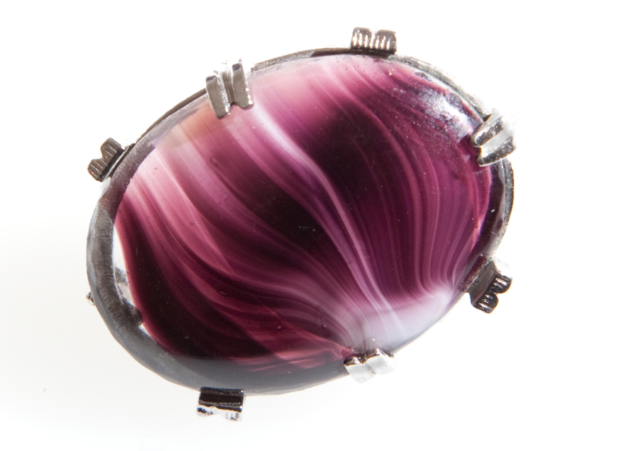
Here are my initial images from my Jewellery shoot, from which I will choose 10. There is a variety of pieces, borrowed form several good trusting ladies, all taken on a light table or light box, but there is another alternative, not used, is what is known as a light cube. The light cube has diffused light (lit from outside the cover), not direct light as I have used for my images. These are the 3 main methods of producing images for this type of product, and they can and do vary by manufacturer, in size and other details.
I have used a variety of styles as well, as personally I do not like the stark bland lighting that is used generally for this type of photography. However I have included for this option. I will now select from these my final 10 images. Further below I have included some images that I have seen and been interested in, but when I came to do my own I changed the images that I had in my mind to suit the material I had and to show the different ways that jewellery can be shown. Each type of image will reflect on how the brief appears and is required, and to the use the image is to be put to.
The images below were taken in the college studio on a light table, with varying lighting and f stops to record the image. One of the main issues I had with using the light table at college was that the surface of the table was very damaged and scratched, which meant that quite alot of post production work had to be done to sort this out. It would not have been to much of a problem(apart from a professional point of view) if the image had been due to be sent for what is known as picture clipping, as the image would then be isolated from the background. For my home studio I used a light box, but this was only powered by a small set of bulbs. it is meant to view slides and suchlike but did allow me to produce some acceptable images.
The use of my 50mm lens has produced some very good images including allowing me to adjust better for the depth of field given the size of the apertures used. When using my home studio I used my 24 to 105mm lens so as to be able to get a little closer to my subject given the small area to work with, and I found it easier to use in this situation, and I got the right results. I have now ordered my own light table so that I can continue with this type of work.
The images below are for discussion and have little or no work done to the image, except to change them to JPG from RAW. This is the initial sort of some of the images I took.
In all cases each image was taken with a Canon 5D MKII.
f5.6-1/125-ISO=100-50mm lens-AWB
This was the first image I took and I like the lighting on this rather than plain white background.
f5.6-1/125-ISO=100-50mm lens-AWB but with lighting adjusted
I have changed the lighting and this does give a different view of the necklace. The above is a better representation of the necklace from my point of view. But this view does have merit for display purposes and it is down to personal preference.
f5.6-1/125-ISO=100-50mm lens-AWB
This is a different necklace with the same lighting as above.
f5.6-1/125-ISO=100-50mm lens-AWB
A slightly more subtle lighting was used for this watch image to cope with the reflections.
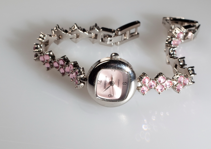
f5.6-1/125-ISO=100-50mm lens-AWB
using 2 watches as a pair.
f10-1/125-ISO=100-50mm lens-AWB
Separate watch.
f10-1/125-ISO=100-50mm lens-AWB
th other separate watch
f10-1/125-ISO=100-50mm lens-AWB
a necklace with the same lighting along with a bracelet
f10-1/125-ISO=100-50mm lens-AWB
A slightly different type of necklace with a slightly brighter lighting
The lighting here was quite bright as I was trying to aviod much post production.
f5.6-1/125-ISO=100-50mm lens-AWB
these are ideal for picture clipping exercise.
The following images were taken using a small light box and stand alone flash units in my home studio - the dining room table.
f14-1/160-ISO=400-105mm lens-AWB
These hand images are an experiment to see how the items look.
f13-1/160-ISO=400-65mm lens-AWB
f18-1/160-ISO=400-105mm lens-AWB
f14-1/160-ISO=400-105mm lens-AWB
These are 2 images of the same brooch, but showing the back and front.
f18-1/160-ISO=400-105mm lens-AWB
f13-1/160-ISO=400-105mm lens-AWB
Below are sample images I have seen that have given me some idea of how to present and meet the brief, with different lighting styles and presentation methods.
There is evidence here that this image has been clipped so as to make it available for many different uses in advertising.
This image may have been "produced" a clipped image on a different background and a reflection added.
This may have been taken on alit background as the shadow is quite subtle, as are some on my images above.
Difficult to work out if this is a "produced" image
this shows several varieties of how to present the product.
This is another way to present the item, but can only be used in this one context. Unless the item is to be clipped as well.
With jewellery the image can be used in many forms and in many types of advertising, and therefore there is a system for isolating the image from the background that it has been upon. This is called picture clipping, which is a technique used to draw around the image. This is usually done over the Internet by a specialist firm, as it is quite an involved job. Below is an illustration of this technique.
Generally Jewellery is photographed on a plain background and shot for multiple use, as the article can then be used in a variety of ways, eg in magazines, on a web site, on a poster, and be placed on a large selection of backgrounds, as the client wants.
I visited the V&A recently and I show below some images of Jewellery that I saw, and the way that they display them.All the images are as shot with no adjustment except to reduce the size and change to jpg.
This jewellery is displayed in the new section of the V&A, and is very impressive in it's layout. The lighting is very subdued and each article is individually lit, but contained in a glass case.
This is a splendid glass necklace dispayed in the same area. This was photographed in a glass case.
This is part of a display of modern Jewellery in a seperate part to the new gallery. It is a modern piece and I have included the disply images as well, but all behind glass
This is in the same section as above and shows another necklace, with a photograph showing how it is worn, incase you are unsure!
This is a bracelet, based on the same comments as above.
These are shots of the display cases showing the way the items are displayed in the shop.
There will be a separate item to explain the final 10 images and how I came to the conclusions that I have come to.