Sunday, 3 July 2011

Air traffic

Spent yesterday afternoon at Tatenhill airfield on the open day. Not much happening but this beauty arrived later in the pm so took some photos.


This is a Diamond DH42, owened by Diamond-Executive Aviation Ltd


This is the Diamond departing, with the MD in the passenger seat. This aircraft had just flown down from Darley Dale microlight field. It was the first aircraft to land on the concrete runway there since World War II, as it has now been cleared, and is a short runway as well, so this did well to get off. The MD had to travel to Tatenhill by car as weight was too much for this aircraft to get off on such a short runway.


A good show of the design of this aircraft, very sleek and sexy. Only £350 per hour to hire


Another view, and a good day to go flying.

There were other aircraft there, which I will update when sorted, including a Firefly. We also got an invite to fly into Cranwell's open day in August, this via the owner of the Firefly that was there, pics later. That will be great.


Thursday, 16 June 2011

grave happenings

Latest addition to my photo career, another variety of images, perhaps I need to make up mind and settle on a theme for a while.

Some portrait and other shots from last night at Hanbury Church, bearing in mind I had no control over the indoor lighting, lit with 2 photo flood lamps.

the man of thunder and retribution, cross him as you will


the grave digger enquiring when I am due


you were saying when?

now then, are you listening

and I told you so


looking from the window of my world


a resting place


Flowers amongst the grave stones


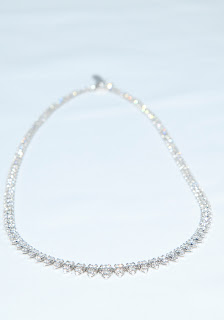
I also have attempted to do some jewellery shots and here they are. Diamonds are very difficult!


a lovely diamond ring


a really elegant pearl necklace, the colours are glorious. Needs a better background though/


Photographed on tin foil, but does show the shape of the pearls.


the pearls on the display bust


the diamond necklace not very good no sparkle.

If someone can tell me how to image diamonds I would be most grateful.

Saturday, 4 June 2011

latest additions and wanderings

I have been doing some different stuff and have added some here.
Hope that I can now improve on them.


This was taken on Thursday evening on one of the Arboretum's evening openings. There tends to be not so many people about and there can be some interesting light at this time of day. Jim and Steve came as well and a good evening was had. The reason I like this view and image is I see it as leading into memories, and is well designed from a building point of view.


With my Dad having spent many years in the RAF this has some memories for me. It is difficult to photograph and I will persevere to get the one I want. I like the idea of the monument in the background.


This is the Basra wall, and with the light this evening it shows a reflection of the monument. In a way this allows one to to reflect on the reason for the Arboretum. Having been brought up in the service life it has a meaning for me as well.


This is Emma from the local dancing school, taken on a Reflex evening I was invited to. Not having any experience of this sort of subject I found it really interesting, the lighting was preset, but managed to achieve a reasonable result with a classic ballet move.


This is Nick putting the final touches to the latest batch of names on the memorial for 2010. What is surprising is that there are now 1600 spaces for names left!


This is Sophie in her flamenco outfit at the same Reflex evening. The evening was very good, but strange having dancers with no music to dance to. I missed the twirling skirt in this one but see the next for this effect.


Sophie again, but well into her stride here, and I have managed to capture some movement this time. Again the lighting was set up already, but the changes could be made with the aperture to suit.

I spent the other Friday night messing about with my light table and Jim's lights and came up with this. It is quite hard to get the lighting right, but I managed a better effort below.

Monday, 30 May 2011

Black country Museum May 2011

Stevie and I enjoyed a day out at the Black Country Museum on Sunday 29th. a dull day weatherwise but a fascinating place and loads of history, with lots of photo opportunites. Shame I missed some of them!

Anyway here are a few tasters

brake blocks on a motor bike?

Chain link-it is big but no scale here

Gentleman's attire

jaws of a lion trap, or river canyon? or?

Miners trolley

the open top tram

Sparky

springs


now my boy, what's going on here? no photo's please


there is no doubt that this is worth another visit but it would be better if the weather was not son dull. the mine was amazing, constructed from 8' diameter drain pipes!!

Wednesday, 2 February 2011

310 / 212 / 205 presenting images

There are so many ways to present your images today. When you want to sell yopur images within the professional market then one way to do this is via a portfolio. If you are visiting a client then this is a good way to show them your work, as well as referring to your web site. But choosing the right portfolio can be very difficult, and this is the one opportunity that you have to amke an impression.
With the great variety and types on offer, re finish, size, binding method and cost.
The portfolio must be presented in a clear and logical way, as it does represent your work and methods to some extent, and be relevant to the job in hand. Don't forget that this portfolio will probably go through several hands and therefore needs to be robust as well as artistic, therefore durabilty, flexibility, persentation and cost will all need to be considered.
These are the parts to be considered:-
Bindings- needs to be flexible enough to update content, but depends on your type of work and how often you need to update. Permanent bindings are veruy good if you do not intend to update eg for 6 months.
Orientation - this is very much a personal choice and depends on the type and style of your photography. It is not a good idea to mix landscape and portrait orientation together. Consider using A3 eg then you can use a combination of portrait and landscape. Some books of photographs use this method to save the reader spinning the book round.
Robustness - Waterproofing, protective bags, slip boxes and a good binding help to withstand the elements, and being thrown around floors, couriers etc. Will the client put the cover on a again????
Size - This is purely a personal matter and to how you want to present your work. The most common sizes tend to be 14x 11ins A4 and A3. Depends on the siz eof your wallet!
Design - A smart and eye catching design can really work, but can be more expensive, but will stand out from the off-the-peg portfolios. Subtle personalisation will really work better.
Quality - Do you offer an quality photographic product? Your portfolio will reflect this. A bespoke or high end portfolio is a quality product and is an investment in yourself, as it demonstrates that you are serious and pay attention to detail.

There are many types of portfolio and listed below are some common types
Leather embossed portfolios- these are like books and come with a variety of binding methods
Ipad folio- to keep up with the latest the this folio has been designed around the apple ipad. Needs technical expertise to view though.
Machina presentation books- these are aluminium covers and lies flat when open, and nylon jackets are available to protect from light, dust and scratches.
Portfolio boxes - been around a long time in any forms, and is a very popular way of showing your images.

BUT YOUR IMAGES HAVE TO BE FIRST CLASS, WELL PRITED AND RELEVANT

Saturday, 22 January 2011

310- colour management

There are several different ways to get the colour of the image correct and to meet the client critera. The two elements are the Macbeth colour chart, which is placed in the image to be taken to give a colour reference, and the Pantone colour chart which will give the record of the item colour to be replicated in your photograph.


This image shows the Macbeth colour chart. Put this card in the picture to be taken and this gives a reference point to calibrate the image on the screen.

This image shows the Pantone colour range, and the technique to achieve the final result. An item has a colour reference, the colour sampler is taken from the area in the image, and this then can be used to correct the image.

Just a note here about Mono black and white prints and printing.

When you have gone to all the trouble to produce the perfect monochrome image you them want this to be replicated in yopur print. Photo printers use many different-coloured inks to produce colour images. The  printer blends these coloured inks in such a way that they produce shades of grey instead of colours, or at least try.However, variations in ink densities, the response of different papers to different ink colours, and any shortcomings in the printer driver software will combine to produce results which are at best variable, and can be unusable. even lighting can make a difference when viewing, due to phenomenon known as "metamerism", where different inks reflect light differently according to whether it's daylight, fluorescent light for example.
There are three principle solutions . first, you can attempt to calibrate the printer to remove any colour casts. secondly, you can use 'black only' ink replacements, from specialist companies, or thirdly, upgrade the printer that supports black and white printing explicitly. If alot of black and white printing is being done it may pay to invest in a "mono only" printer. In which case investment in grey ink will prove to produce better quality prints. This will save all the hassle of profiling the printer or investing in third party suppliers.
The choice of printer and solution will depend on the quantity of work being carried out.

Monday, 17 January 2011

310 - printing problems

There are several basic things to think about when avoiding problems with printing and should be carefully considered.
1 use suitable size of printer and inks to suit the project, whether owned or printed commercially. Make sure that for some printers the cartridges are in date.
2 Use sufficient pixels (for digital printing)  for the image requirement.
3 Locate a printer in a dust-free enviroment as much as possible. NB I was advised at my professional studio visit that they do not do picture framing on the premises due to the dust created ( see my seperate blog for images etc)
4 Do regularly maintain the printer/s eg check the nozzles are clear, clean the heads, perhaps once a month, as they do get clogged up, or when changing cartridges. Ensure the print heads are aligned and a routine is set in place to regularly check this.
5 Ensure that the correct inks are used for the type of image being produced. Keep a check on ink levels, as you do not want 1 colour to run out half way through a print. Special inks are required for archival use for instance.
6 Handle all items with care and with clean hands.
7 Store paper and inks at the right temperature and to manufactures recommendations.
8 Ensure the monitor, printer and paper are correctly calibrated to each other.
9 Before printing check that the printer is working, and the parameters of your print are correct to save errors, waste, eg portrait/landscape, print size. paper size.
10 Adhering to basic practice should save time and money in the printing process.
11 For longevity you need to purchase, and have printed, the best quality paper you can, and should match the make of printer that is being used as the manufacturer has done the engineering to provide the best possible print.
12 Let the prints dry, be very careful when hadling the print straight out of the printer.

There are however problems with printing and in a perfect world there should not be any. But there are, and even sending them away for printing is not perfect, as you have to match the outputs. Plus, due to the cost of having your own printer A3 for example, it becomes expensive.. Unless you are operating as a professional business then it is cheaper to send them away. but you still have to ensure that your monitor, printer and paper used is compatible.

 Some common problems.

Prints are lighter than expected, have white spots or horizontal lines - These are signs of a clogged head, and shopuld be cleaned using the printers utility programme. Sometimes you may have to leave the printer overnight to let the ink soften, then try cleaning it again. One solution could be to turn the printer off at night on the printer. Some models have a capping device that protects the nozzles. Sometimes you may have to run a test print prior to your print run saves ink in the long run.

Vertical lines are jagged - this is an indication that the print head is out of alignment. run the printers utilty to check this and correct.

Colours are missing, prints lack shadows and contrast-Colours can begin to print inconsistantly even before the printer tells you to replace the cartridge. try replacing them, this amy improve the colour quality. It could also be down to a clogged nozzle, so cleaning of the print head will be required. If the print lacks shadows and contrast the black ink may be at fault. Colour quality can sometimes suffer if not used for a while, in particular, 6 months. trty swapping with a new cartridge if cleaning has not solved the problem. Check to see if you have loaded the inks in the right slots!!

Prints are blurry-The paper may be damp, very old or loaded the wrong way round. Try using different settings. These can be found in the print menu.

Prints are grainy-if all checks and cleaning have been done, then try switching to a higher quality setting, or to the manufacturers paper if using another brand. High quality paper and manufacturers inks give fewer problems.

Prints have tiny puddles of ink - referred to as puddling, this can occur if the wrong paper settings are selected, or used with incorrect paper, not designed for the printer. Occurs especially on glossy paper, so use the manufacturers paper. to address the problem open the print dialog box, switch to the print settings and verify the correct paper stock is selected.

Prints have bands of heavy ink - this is due to too higher a print resolution, especially on uncoated or art papers, as this causes the printer to use too much ink. Most printers don't let you select a resolution, so try alower print quality.

Black and White images have a colour tint- colour should be turned on when printing black and white as this will give smoother graduations and richer tones. many printers havce difficulty producing neutral grayscale images. wait until the print drys, even overnight. if not then try altering the colour balance in the printers colour management settings, if possible. Experimentation may be required.

Images are darker or lighter than expected- the first thing to do is to calibrate the monitor. if still a problem check the Gamma settings(which control the brightness of on-screen images) in the printer driver matches the one you used to calibrate your monitor. Because the way papers absorb ink, dark shades of grey may appear as solid black when printed. the print iamge may have to be adjusted to solve this.

Colour/tonal balance- the print is reflective and the screen is emmisive, therefore the print will be subtlely different to that on the screen. This is where the calibration methods come to the fore, along with  the various elements you can use eg white balance, exposure.